Designing for a brand new online financial tool: Harbor
✍🏼 Project
UI design of the dashboard and the homepage of the marketing website of an online financial tool -- Harbor
👩🏼 Role
UI Designer
⏳ Timeline
3 weeks (in 2017)
🎨 Tools
Sketch, Invision, Principle

Overview
The number of people who are prepared for retirement drops drastically in the US since people don’t have enough savings or don’t know how much money they need to save to retire. Harbor is an online financial planning tool that let users play with scenarios to make a better retirement plan. When I started working on this project, they were brand new startup that aimed to make high-quality financial planning accessible and affordable to the 65% of Americans who are not receiving any advice today.
My role
We worked with Harbor for a 3 week, fast-paced UI project to create a new design language for their brand new product. As a team of four UI designers, we collaborated on getting know the client and their business goals, market research, and visual competitive analysis. Then each designer redesigned the current product of Harbor individually and delivered a prototype and style guide at the end of the project.
Understanding the challenge
In the first days of the project, we tried to understand Harbor’s business needs, get to know their brand identity, how and to what extent we can help them to achieve their goals in this limited time frame. To be able to get a better understanding of those subjects; we asked lots of questions about the company and its brand, and we also did a gut check exercise to see our clients’ initial reaction to different visuals and to make them think how these visuals align with their brand goals. As a result of the exercise, we discerned that Harbor’s design should reflect its trustworthiness and transparency, but also its distinctness from other basic retirement calculators out there. After the kick-off meeting, we understood that Harbor's software was still a work in progress and had a lot of incomplete or inconsistent parts across the platform, and our primary goal was to build a comprehensive design system that can be applied to both the current platform but also many future screens to come.
While building a new design system, there were 3 other aspects we really needed to take into consideration:
👴🏼
Harbor is a retirement planning tool with the main target audience of Baby Boomers.
🤝
The feeling of trust is very important for financial services.
😩
People find financial information complicated and overwhelming and give up quickly.
Combining these 3 factors created a unique challenge for this project:
We needed to design a simple and trustworthy interface so our target audience of Baby Boomers could use it easily even though they use technology differently and can be less tech-savvy than younger generations.
Research
1. Getting know the market
After understanding our client, our product and its needs, we started our research about Harbor’s competitors to understand the market, and looked at who else is out there. My team and I examined 12 financial websites/tools and came across with some common visual patterns.

Although some websites use serif fonts for headers and logos, which brings a sophisticated feeling, most websites use sans serif fonts and it works better for legibility.

A big majority of the financial tools use a blue color palette, which instills a sense of trust but it also makes differentiation harder among the financial products.

Using cards and multiple font families, sizes and weights added visual hierarchy and organized overwhelming financial information in chunks. That created a visual path for the eye to follow.
With this market research and analysis, we confirmed that typography played a big role in accessibility, and color choice was very important for the look and feel of the product but also for its market differentiation. We also found that organizing the data with UI elements helped to digest the overwhelming financial data easily.
2. Bringing the pieces together
Our kick-off meeting and market research provided some essential insights about designing for Harbor. As a team, we combined them together and built our visual guidelines to help us designing with users and brand goals in mind, and also for the Harbor team when they design additional screens in the future. As a result, we came up with 3 design principles:
🤝
Partners in trust
Since planning for retirement is stressful, we want users to know they can rely on the Harbor brand as the best choice to find the necessary information they need to create a strong, secure financial plan. Our designs should support this with visual hierarchy and organization of UI elements, consistency across the platform, and clearly defined navigation.
✏️
Let’s make a plan
Users should feel empowered and eager to jump into the financial planning process. With Harbor, they have informative tools at their fingertips, so they feel in control of their financial goals. Our designs should utilize colors that provide contrast for easy scannability, visually accessible fonts, and clear presentation of relevant content to engage the user.
🔑
Clarity is key
We want users to view retirement planning with the ease and clarity of a professional investor, without hidden fees or outside pressure. They can start with the basics, and delve deeper as they become more comfortable. We will create a clear and focused interface through the use of white space, minimal text, authentic imagery, and progressive disclosure of information.
Design directions
With our design principles, user needs, and brand identity in mind, I created 3 design directions and presented them to our client to find out which direction would best fit their brand goals. In all my style tiles, I chose UI elements from both the marketing page and the planning tool to be able to show that direction’s cohesive reflection across the platform. I also thought about ways to make the information more visible and digestible for our Baby Boomers and color-coded the scenario changes in the graph.
The bright one

I went with a dark blue/purple and soft but bright colors to keep the familiar and trustworthy feeling of blue but also differentiate from the standard blue of financial websites. I had dark blue color blocks for headers to make the beginning of each section more visible to users. I also highlighted the expanded section with a yellow line since a long list of parameters might be overwhelming for users and differentiating collapsed and expanded questions might be hard.
Client feedback: Our client liked the modern look and feel of this. They also liked the contrast in the headers and graph.
The planner one

Since our challenge was to design a trustworthy platform that also shows its differentiation from other basic retirement calculators, I deviated completely from the standard blue color palette and used brown and natural tones to have a solid, mature and different look. I also organized the long sections on the right side of the tool with a navigation tab.
Client feedback: They thought this direction conveyed trustworthiness and uniqueness. They liked the non-distracting natural tones.
The calming one

Since people might feel overwhelmed with the financial data, I created this style tile using very soft, calming and soothing colors. I used very rounded shapes and fonts to have a friendly and welcoming look.
Client feedback: They liked having calming and soft colors but thought they were too soft. They liked rounded corners on buttons but not on cards.
Overall, our client liked the natural tones and thought that they were unique. They also loved the changes I made to make the platform easy to use by color-coding, highlighting and organizing.
Building, testing, and iterating
Designing the initial screens, I combined elements from each style tile that worked well and were liked by the client. Since Harbor was looking for an opportunity to differentiate from other competitors I decided to pursue that direction and used a brown color palette. My primary goal for the first round of designs and user testing was to establish a solid foundation and to understand user needs so I could build more on that for the next round.
How I approached the problem
Our project scope was to redesign Harbor’s dashboard and marketing page while creating a cohesive design language to apply to other screens. After designing our initial screens, we tested them with four users to see how desirable they were and how they aligned with Harbor’s brand goals.
Harbor's current dashboard
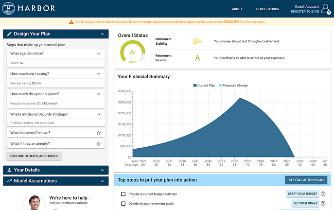
Harbor’s current dashboard consisted of two parts: the left side where users can work with financial information, and the right side with financial scores and a graph to see their current plan. The graph reflects the changes in their retirement plan while they experiment on the right side.
Dashboard design version 1.0

2
I highlighted the expanded boxes where users change their information and retirement scenario with a bright green line to make it easier to scan because the list of things they can change on the left might be really long.
3
I used rounded buttons to have a friendly and approachable look.
4
I added a progress bar to the action plan section to keep users on track and see their accomplishments.
First round of testing:
👴🏼
🧓🏼
👵🏽
🧓🏿
We did a desirability testing with 4 people from the Harbor's user target. Users responded well to clear contrast in the headers and separation between two sides of the page saying that their eyes had a path to follow. They appreciated the organization of the elements and cleanliness of the screen; however, they didn’t find the brown color palette approachable and thought there wasn’t enough use of color to grab their attention.
Harbor's current marketing page

Since Harbor’s marketing page was recently built, there were lots of inconsistencies with headers, sub-headers and body text throughout the website and also with the tool itself.
Marketing page design version 1.0

1
I used a photo of a retiree with his grandson at the beach as a hero image to test whether users like to see people sitting and planning their retirements or active people having a good time in their retirements.
2
I added a screenshot of the tool so users can have an idea about it without registering.
3
I added icons to make it visually more appealing and approachable.
First round of testing:
👴🏼
🧓🏼
👵🏽
🧓🏿
Our testers liked the idea of active elderly photos but couldn’t relate to the photo of the elderly guy. They liked the simple and clean look but some of them thought the dark color was too cold and didn’t feel friendly.
Overall, the users liked the layout and organization of the screens but they didn’t like the color palette and found it cold and unfriendly. This helped me to understand that I couldn’t sacrifice approachability for the sake of differentiation.
1
Since the right and left sides serve different purposes, I separated them visually by adding a background color and kept the color block headers on the left side, whereas I maintained the clear and simple look on the right side and didn’t use any additional colors.
A new challenge
During the project, Harbor told us they wanted to change the current dashboard and provided us rough wireframes of the new dashboard. It would be challenging for our team to tackle the new wireframes but after having a foundation and direction with the first round of designing and testing, I decided to work on them for the next round of user testing. I saw it as a challenge to tackle UX considerations and to think about the product and its functionality in depth.
Harbor's new wireframes


1
The new dashboard had a timeline on the right side where users can add an event in 2 categories: life goal events and financial events.
2
To add a new event, users click on “add a new event” button and a drawer comes from the right.
3
They choose the event to add and click and drag it to the timeline. (slide left)
4
When users add or change events in the timeline, the scores and graph also reflect the changes simultaneously and compare the current plan with the proposed changes in the scenario.
5
Proposed changes in the graph could be below and above the current plan graph at the same time. (Currently, the proposed change graph shows only positive change and goes above the current plan graph)
Problems with the new wireframes that I need to tackle:
-
I needed to design a timeline with many details, in a simple way so the users would not feel overwhelmed but would understand the relation of the elements in the timeline with the graph and scores.
-
I needed to design the drawer and “add a new event” feature in an easy way to use for our target audience.
-
I needed to build a design language that showed both the positive and negative change at the same time in the graph and scores.
Based on the feedback I got from our first round of testing and the Harbor team, I designed the new dashboard with a new color palette. This time I used more familiar colors but tried to choose a different, more purple shade of dark blue, again with a green accent color.
After spending some time with Baby Boomers in interviews and seeing how poorly some of them used technology, I tried to make each interaction and function very obvious and easy to use.
Dashboard design version 2.0

1
After a couple iterations, I designed a new timeline with each event on a card, and gave each card a highlighted line representing the event category. All cards expand to see more information and change the information in it. I moved the colored background to the right side of the dashboard to keep the separation between the timeline and the graphs because I didn’t want to crowd the timeline with a background color.
2
Although all the users I tested understood the cards were clickable, I added an extra arrow to the cards to decrease the cognitive effort even more.
3
For each event card, I also added highlights with the event color on the graph.
4
I changed the graph from a color-color filled graph to a line graph and color-coded the positive changes with green and negative changes with red for the proposed change graph, since the new scenario graph might show both positive and negative changes at the same time.
Overall, the second round of users we tested responded very well to the new changes in the dashboard and when they interacted with the prototype they could navigate easily in the timeline. They also understood the graph’s response to the changes they made in the timeline. However, they couldn’t see “add new event” button initially.
Final screens
After user testing, I did some minor changes to the dashboard based on the feedback and focused on adding some microinteractions to the dashboard to make the platform easier to use for Baby Boomers.
Dashboard design final version

I changed the “add an event” button to make it more visible to users.
Marketing page design final version

I used a photo with both genders as a hero image, so more people can relate to it.
Hover states

Since the timeline can get long and overwhelming for users, I added hover states to make the connection more obvious between the timeline and the graph. Every time users hover over a card, that event gets highlighted in the graph with more information.
No more drag and drop for Baby Boomers
After doing some research about drag and drop features, Baby Boomers, and seeing how they interact with the platform during our interviews, I decided that drag and drop is too much to ask, even for younger generations. When users couldn’t navigate easily and understand the platform, they would just give up and think it’s too complicated to use. So, I came to the conclusion that Harbor needed to not use any other interaction than a simple “click”.
I redesigned the right drawer so that users see the events they want to add on cards, same as the timeline. After they fill out the event card, they just click to “add to timeline” button and it places to its spot in the timeline with an animation. So that, again, they could see the connection with the right drawer and the timeline, also they recognized the consequence of their actions immediately.
Conclusion
When I presented these changes and show my prototype to Harbor team, they loved the clean look of the timeline and especially the microinteractions I created to make our specific target audience more engaged. They appreciated that I thought about the product and its usability for their specific target user.
👨🏻
Billy from Harbor
“Great job! These are all very smart animations to grasp users’ attention.”
🧑🏻🦱
Nick from Harbor
“You did a really good job, I wouldn’t be surprised if we apply these changes to our platform!”
At the end of the project, I designed and delivered a comprehensive style guide that includes the UI elements, design system and solutions I created for Harbor, which can help not only the current platform but also any screens they would build in the future.
Since our time frame was only three weeks, there were some areas I couldn’t touch or dive deeper. If I had more time, I would explore more how to group events in the timeline because Harbor didn’t know how to group them yet either. I would also like to design the onboarding and other pages of the marketing website because they all have many screens but mostly inconsistent from each other.
What I learned
This was my last project at Designation and it taught me the importance of understanding users and their needs. Coming from finance background helped me to feel more familiar with the product and to think in depth about the data visualization of financial data for a specific target audience. I researched a lot and learned so much from the interviews we did about designing for Baby Boomers. And I also realized that unfortunately many interfaces we see today are not designed with them in mind. Working with Harbor taught me that good design should be accessible to everyone and accessibility shouldn’t get sacrificed to being pretty. On the other hand, I really enjoyed working with a brand new start-up, so that I could find more room to think and iterate about the current product. I loved finding solutions to make users use the product easily through visual design and microinteractions.